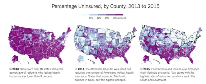
First, I despise graphs/charts that display % of apples and oranges, even when done by the NY Times.
Today's NYT article starts out with maps of the states (apples) showing %'s of un-insured (oranges).
The geographic size of various states over-shadows the percentage value.

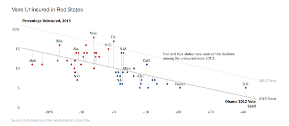
But eventually the authors get to the core of the matter - politics
 We Mapped the Uninsured. You'll Notice a Pattern
NY Times
 - QUOCTRUNG BUI and MARGOT SANGER-KATZ - OCT. 30, 2015
Quote:
They tend to live in the South, and they tend to be poor.

Politics matters.
Though several states with Republican leadership have expanded their Medicaid programs, many have not.
Over all, Republican-leaning states continue to have more uninsured people
than Democratic-leaning ones. But they also tended to have many more uninsured people at the start.

|