
|
|
|||||||
| Image of the Day Images that will blow your mind - every day. [Blog] [RSS] [XML] |
|
|
Thread Tools | Rate Thread | Display Modes |
 11-06-2004, 10:51 AM
|
#1 |
|
Radical Centrist
Join Date: Jan 2001
Location: Cottage of Prussia
Posts: 31,423
|
11/6/2004: Visual display of the electoral divide
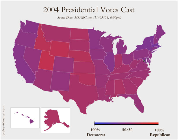 Is the US a horribly divided country? Should panicky Kerry voters in "red" states move to "blue" states? Not at all. We've all seen the red-blue state depiction... ad infinitum. Fans of Tufte's work on visual display of quantitative information may enjoy the differences between that approach, and the above. The above shows us an entirely different view of the country, but one that's more meaningful to the character of the country than the standard red-blue. The standard shows us red, if the divide is 51% red, 49% blue, and vice-versa. The above shows that divide exactly as it is. This guy has produced the same "purple" county-by-county, too large to link here directly, but it's a beautiful thing. Compare those maps to to this one: 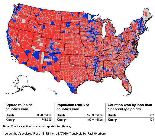 This one is being used by R folks to suggest that the red-blue divide in the country is deeper than it is, and that the country is actually much more red than blue. Not the case; it's merely the wrong way to display the results. The above map tells you nothing because it biases for geographic area taken up in an election that divided urbanites against suburbanites and ruralites. The blue areas look small, but the appearance is deceiving; it's only because the people there are concentrated into a small area. This gentleman has corrected for that problem, and produced cartograms, where the visual size of the counties is adjusted for their population size. That produces a very strange-looking graphic indeed, but it's actually more accurate in many senses than the red-blue county map. |

|

|
| Currently Active Users Viewing This Thread: 1 (0 members and 1 guests) | |
|
|


 Threaded Mode